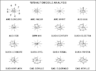
The star plot is a method of displaying multivariate data. This one is showing cars from 1979 and depicts different characteristics of each in the "points" of the star. Something interesting is that none of the cars had good gas mileage marks. http://www.itl.nist.gov/div898/handbook/eda/section3/starplot.htm
Monday, December 8, 2008
Correlation Matrix
A correlation matrix describes the strength and direction of a linear relationship between two random variables. This matrix describes the tissue to tissue correlation in livestock. http://www.livestockgenomics.csiro.au/Genome_to_Phenome/
Similarity Matrix
A similarity matrix is a matrix of scores which express the similarity between two data points. For this case the points of similarity are from the Bible and the languages it has been translated into. http://www.cse.iitb.ac.in/~prnv/html/html_sim/index.html
Stem and Leaf Plot
Stem and leaf plots are a method for showing the frequency with which certain classes of values occur. This plot shows the per capita GDP of Western Africa. http://mainland.cctt.org/mathsummer/JosephBond/StemAndPlots/stem-and-leaf_std.htm
Box Plot
Box plots are used to graphically display groups of numerical data through five number summaries. Here the graph is comparing two populations of people. http://www.bioinformaticszen.com/2007/10/comparing-two-populations-using-different-graph-types/
Histogram
This histogram is a tabulation of students and their final exam grades. That is exactly what a histogram depicts, tabulations of values and expressed in a graph. It seems quite a few students received A's and B's. http://searchsoftwarequality.techtarget.com/sDefinition/0,,sid92_gci330729,00.html
Parallel Coordinate Graph
This map is that of a parallel coordinate graph. These types of maps have each number plotted on a vertical coordinate to show different vales of different variables. http://www.iwi.uni-hannover.de/lv/seminar_ss05/bartke/geomet.htm
Triangular Plot
Triangular plots are used to show soil composition. This one is showing that the area in question is high in clay deposits. http://images.google.com/imgres?imgurl=http://www.dplot.com/examples/ex14_h600.png&imgrefurl=http://www.dplot.com/&usg=__ebAdimAZxM0V5KAYoJk7DN-J8zg=&h=600&w=660&sz=15&hl=en&start=24&tbnid=Fjm-lyBTkIkZdM:&tbnh=125&tbnw=138&prev=/images%3Fq%3Dtriangular%2Bplot%26start%3D21%26gbv%3D2%26ndsp%3D21%26hl%3Den%26sa%3DN
Windrose
Windrose diagrams are used to show the wind speed and direction in which the wind is originating from. Here is a windrose in Port of Memphis, interestingly the majority of wind direction is north and south. http://lion.cs.uiuc.edu/projects/wsn_ornl.html
Climograph
A climograph is a graphical depiction of the monthly precipitation and temperature for a specific place. Here is one for Manaus, Brazil. As you can see the coldest month of the year is August, but has one of the highest amounts of precipitation for the year. http://www2.volstate.edu/kbell/climographs.htm
Population Profile
These are graphs that are commonly used to show the trend in population over a period of time whether it be up or down. Here we can see the age of the population for the year 1995 and the assumed count for 2025. http://www.mag.maricopa.gov/archive/vv2025/Presentations/Seg1/SEG1-1/sld013.htm
Scatterplot
A scatterplot is a graph that uses all the points of interest to provide a mean value to concentrate on. Here is a plot that is clearly increasing as the values go up. http://www.schneider.pro.br/paginas/pesquisa/estrutura_do_relatorio.html
Index Value Plot
This index value plot is displaying stock indexes over a period of days. The erratic values are consistent with the ups and downs of the stock market. An easier way to read the values would be to average the daily value into a weekly report. http://www.justdata.com.au/Journals/Articles/trin.htm
Lorenz Curve
Commonly used to depict income distribution the Lorenz curve is also used to show distribution of assets. It was developed in 1905 by Max Lorenz. Here the curve is showing the income distribution in 1978. http://ingrimayne.com/econ/AllocatingRationing/MeasuringIncomeDist.html
Bilateral Graph
Bilateral graphs show values above and below the zero mark. This is done to show not only the positive values but the negative ones as well. This graph is showing the amount of force it takes to row a boat. http://www.rowperfect.com.au/innovative_training.html
Nominal Area Choropleth Map
These types of maps show every value that the cartographer is trying to show. Each value gets a specific color and the parts of the map that have that characteristic get that color. Here we have a map of Eastern Washington and the population of each county. http://www.spokane.wsu.edu/gis/Classes/LA467/mapty.htm
Unstandardized Choropleth Map
These types of maps also portray areal data but do not average the areal data in any way. They show data in a manner that is in no specific order or has no values. Here we have the threat level of languages. http://dd.dynamicdiagrams.com/category/visual-explanation/
Standardized Choropleth Map
These types of maps show data in an areal manner. This particular one is showing the alumni of Central Michigan throughout the state of Michigan. The data is broken up by number of alumni per county. http://www.mymaps.com/collegemap.htm
Univariate Choropleth Map
Univariate choropleth maps in contrast to bivariate have one value that is shown. Here the population in Ohio is given. http://gis.esri.com/library/userconf/proc99/proceed/papers/pap171/p171.htm
Bivariate Choropleth Map
Bivariate choropleth maps display more than one type of information. Here the median household values in Ohio are shown. http://gis.esri.com/library/userconf/proc99/proceed/papers/pap171/p171.htm
Unclassed Choropleth Map
Unclassed choropleth maps show statistical data in colored values ranging from smallest to largest. Here we see the difference in classed and unclassed choropleth maps with the unclassed being on the right and having many more values than the classed version. http://go.owu.edu/~jbkrygie/krygier_html/geog_353/geog_353_lo/geog_353_lo07.html
Classed Choropleth Map
Classed choropleth maps show value ranges at smaller intervals to reduce the amount of variables in the range. Here the value of tax expenditure per student in Virginia is shown. http://personal.uncc.edu/lagaro/cwg/color/color_symbol.html
Range Graded Proportional Circle Map
With these types of circle maps there are finite sizes of the circles to show values. In this map we see the median rent for renters in the Northeast United States. The values associated are between 300 and 600 dollars per month. http://www.neiu.edu/~ejhowens/377/examples.htm
Continuously Variable Proportional Circle Map
This map is a circle map of the volcanism in the Colombian region. Continuously Variable circle maps can be used to plot infinite points of variable sizes, here to show strength of volcanic activity. http://www.volcano.si.edu/world/volcano.cfm?vnum=1501-08=&volpage=var
DOQQ
DOQQ is short for digital orthophoto quarter-quadrangle. These types of images are used to help regulate certain industries. Here this map of Texas is used to prep for flood insurance rates around Lago Vista. http://www.crwr.utexas.edu/gis/gishydro00/Class/trmproj/Donnelly/termproject.htm
DEM
DEM stands for digital elevation model. These kinds of maps are used to show the elevation of a specific area. Here the elevation of Sturgis, South Dakota is shown with colors to provide depth. http://edc.usgs.gov/products/map/drg.html
DLG
DLG, or digital line graph is a map that depicts geologic features. This one shows borders, water, and transportation information in Tennessee. http://edc.usgs.gov/products/map/drg.html
DRG
DRG stands for digital raster graphic. These types of maps are images of topographic information. This particular one is of the Hartford, Connecticut area. http://edc.usgs.gov/products/map/drg.html
Isopleths
This map of the US is showing the wet chloride distribution through the use of a isopleths. Each observed range is shown by the use of a different color respectively. http://nadp.sws.uiuc.edu/isopleths/maps2003/
Isopach
Isopach maps show the thickness of rock at specific points. The contour lines represent equal thicknesses at the given intervals. Here the earth's rock thickness is measured. http://www.fas.org/irp/imint/docs/rst/Sect19/Sect19_6.html
Isohyets
Here are the isohyets observed in India. The lines represent rainfall amounts observed in India for 1975. http://www.unu.edu/unupress/unupbooks/80391e/80391E03.htm
Isotachs
Isotachs are units of measurement for wind speed. Here the wind speed over the Southeast portion of the US. http://weather.cod.edu/help/700help.html
Isobars
Isobars are used to indicate equal points of mean sea level pressure. This map is showing the isobars over the UK and Ireland. http://www.weatheronline.co.uk/reports/wxfacts/Isobars-on-surface-maps.htm
LIDAR
Lidar, or light detection and ranging, is a form of imaging that is used to map topographic data, This image is of a Canopy Structure that U.C. Berkeley Biometeorology lab uses. http://nature.berkeley.edu/biometlab/fieldpics.html
Doppler Radar
This Doppler radar image is of hurricane Claudette as it moves onto the Texas coastline. Doppler radar is used to show weather and precipitation as it is changing and progressing. http://www.noaanews.noaa.gov/stories/s1192.htm
Black and White Aerial Photo
This photo of Wrigley Field is an example of a black and white aerial photo. I find this one interesting because I am an avid baseball fan and enjoy the history associated with this Chicago landmark. http://www.horschgallery.com/addtocart2.aspx?pdctid=%C5%93N%1C
Infrared Aerial Photo
Infrared aerial photos are exactly what they sound like. It is a photo of an area, in this case the Susquehanna Water Gap in Harrisburg, that is taken with an infrared camera that shows different levels of vegetation that react differently in infrared light. http://rst.gsfc.nasa.gov/Sect10/Sect10_1.html
Cartographic Animation
Cartographic animations are maps that show the potential of certain areas. In this case the water level in Galveston, Texas after a hurricane is being depicted. http://www.3dnworld.com/gallery.php?user=CHanson
Statistical Map
The Denver area crime report is the subject of this statistical map. The colors represent the areas in which crimes have increased or decreased in the years 2001 to 2002. Each area has a percentage that shows the rate of change from the previous year. http://www.denvergov.org/2001_crime_stats/AllOtherCrimes/AllOtherCrimes2/tabid/377596/Default.aspx
Cartograms
This cartogram is showing the population of the United States. As you can see the bulges correspond to areas of high population and the colors relate to the counties that the population is observed. http://issrweb.asu.edu/services/gis/sample-maps.html
Flow Map
Flow maps show the flow of one area to another through lines that follow the areas of travel. This particular one shows trucking routes the originate in Texas. The darker lines show more concentrated traffic while the lighter lines depict less flow. http://www.lib.utexas.edu/maps/texas/combtrk_tx_1998.jpg
Isoline Map
In this isoline map the Chinese water system is being observed. The runoff is taken into account and shown here with isolines showing that although there is adequate water many regions are left without enough water to sustain agriculture. http://www.unu.edu/unupress/unupbooks/80157e/80157E09.htm
Proportional Circle Map
Mexican people living in the Western United States is what is being described here in this proportional circle map. These maps show values in large or small circles corresponding to the values observed. http://www.neiu.edu/~ejhowens/377/examples.htm
Choropleth Map
This choropleth map is that of electoral votes during the 2004 presidential election. The values are percentages of the votes that correspond to the voters. As you can see the amount of electoral votes per voter is higher in areas of less population. http://www.cartisan.com/map_resources/map_types/choropleth.html
Dot Distribution Map
This dot distribution map is one that shows the population density in the Virginia countryside. It was developed by the Census Bureau in April 2000. http://www.baconsrebellion.com/Issues03/09-22/Scatteration.htm
Sunday, December 7, 2008
Propaganda Map
This map depicts the Middle East the way the cartographer sees it. Propaganda maps are not always the truth but try to sway perception of ideas. http://unitedcats.wordpress.com/2006/10/04/new-middle-east-map/
Hypsometric Map
This image of Tajikistan is in the form of a hypsometric map. These types of maps show elevations in the form of colors rather than lines as topographic maps do. http://www.rrcap.unep.org/centralasia/reapreport/Map/MOUNTAIN/map_2.jpg
PLSS Map
Public Land Survey System is a type of map that uses zones of 6 mile intervals to make up a township that is used to mark land ownership. Here is a map of Franklin County, Alabama that shows the townships. http://www.rootsweb.ancestry.com/~alfrankl/landrecords.htm
Cadastral Map
A cadastral map is one that shows land plots and ownership of those plots. This particular one is showing the ownership in the state of Delaware. http://www.dalisproject.org/(S(i5f51u55yhwilv45hpbg5avs))/pages/findMapsheet.aspx
Thematic Map
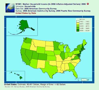
The median income of each state is shown in this thematic map of the United States. Each value range is given a color and the corresponding color is then assigned to the states. These maps are convenient when looking for a generalized value. http://www.visualizingeconomics.com/wp-content/uploads/census_2006income.gif
Subscribe to:
Posts (Atom)